Sunday, July 5, 2015

What can we learn from Presidential tax returns?

Last Tuesday, Presidential hopeful Jeb Bush publicly released 33 years of tax returns, more than any candidate in history. He likely did this, at least in part, to avoid the pitfalls that Mitt Romney experienced in the 2012 election cycle. Romney begrudgingly released only two years of returns, revealing that he had paid an effective tax rate of 14.1% in 2011, mostly on tax-advantaged investment income. Jeb Bush, on the other hand, reports that he has paid an average effective rate of 36%. This rate makes good headlines and plays well to his political message, but it is unusually high, especially for someone with the means to hire expensive tax advisers. As tax expert Joe Thorndike has stated, "It’s either poor tax planning or very good political planning."

To understand what these tax rates mean in real terms, it's important to know the difference between marginal vs. effective tax rates. Marginal tax rates are what we mean when we talk about tax brackets. However, there's a lot of misunderstanding about how tax brackets actually work. The tax bracket you are in tells you the rate you would pay on any additional income you make this year, but it doesn't mean you pay that rate on all of your income. You pass through all of the lower tax brackets each year, paying those lower rates, before reaching your highest rate.

To illustrate this, let's look at Jane Doe, who is a single person making $90,751 in taxable income this year. This puts her at the very bottom of the 28% tax bracket. (You can see this year's tax brackets and rates at this post by Taxgirl.) To figure her tax, we would first look at the lowest tax bracket, 10%. Jane will pay this rate on the first $9,225 that she made this year. After that, she'll pay 15% on the next dollars she makes until she reaches a total income of $37,450; then 25% from that point until her total reaches $90,750. Only one dollar of her income is above that threshold, so she will pay the marginal rate of 28% only on that one, single dollar. (If she were to get a bonus or any additional income, she would continue to pay that marginal rate on this new income.)

The effective tax rate, on the other hand, is a weighted average of those rates - or more simply, the actual percentage of your overall income you paid in tax. In our example, Jane would pay $18,481.53 in tax, for an effective tax rate of about 20.4%. Of course, a variety of deductions, credits, and additional taxes can push the effective rate in either direction.

The practice of Presidents releasing their tax returns publicly became common in the 1970s, and a number of returns released by Presidents, Vice Presidents and candidates can be found at the Tax History Project. This gives us a great deal of information about the financial situation of these Presidents. Let's delve into this data by comparing the average income they made while in office, and the effective tax rates that they paid. The amounts are adjusted for inflation for better comparison.
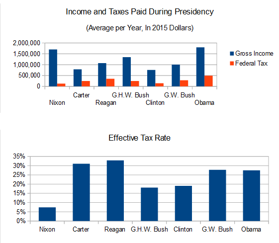
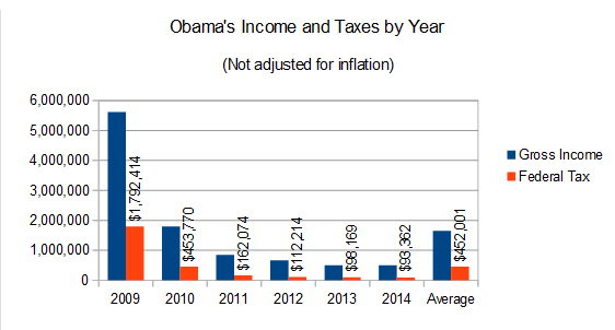
President Obama appears to be the highest-earning of the modern Presidents, though this is slightly deceptive. Most of Mr. Obama's income comes from book royalties, and these have not been even from year to year. He made a total of $5.6 million in 2009, when he was freshly elected and at the height of his popularity; a lot of his books sold that year. Since then, his income has dropped sharply.
Nipping at Obama's heels is Richard Nixon, who had the second-highest inflation-adjusted income of those we have data for, but paid a far lower tax rate than anyone else. Like Obama, there was some variation from year to year, but for a different reason. His income was relatively level throughout his Presidency, but the amount of tax he paid is another story. In 1969, his first year in office, he paid a seemingly reasonable 22.1% effective tax rate. (This at time when federal tax rates were much higher than they are now, with a top marginal rate of 70%.) The following year, he paid only $793 in federal tax, for a downright comical 0.3% effective rate.
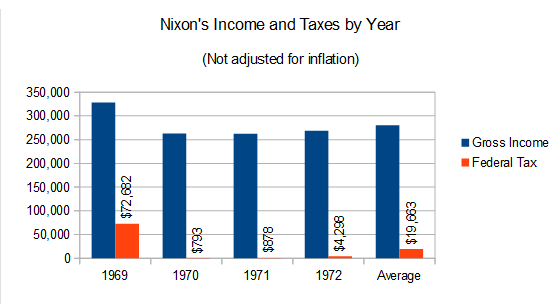
How did Nixon manage to pay so little in tax? If you know his reputation, you could probably guess: he cheated. Hard.

Though the IRS reviewed Nixon's tax returns when they were filed, and accepted them without change, it was later found that these reviews were perfunctory and that the IRS essentially gave him a pass. At the same time, Nixon was using personal tax information obtained from the IRS against his political enemies, so it seems that a number of officials in the agency were in his pocket. Ironically, Nixon's tax situation may have been unraveled by his own attempt to give the illusion of transparency. Nixon announced in 1973 that the IRS had audited his returns and found no problems, stating that "this is good news for people who wonder if presidents are exempt from what the IRS does." This announcement raised more questions than answers for the press, which dug deeper and eventually revealed how little tax Nixon had been paying. This grew to be a major scandal at the time, and had it not become overshadowed by the more ominous Watergate scandal, it might have been Nixon's downfall.

Eventually, Nixon's returns were subjected to a more thorough, independent audit by the Joint Committee on Taxation. They found that he had taken some very large improper deductions, and excluded the gain on real estate he had sold in New York and California, among other things. Nixon was forced to pay $465,000 in back taxes, about half of his net worth at the time.

Nixon's debacle, incidentally, is what inspired the practice of Presidents and candidates releasing their tax returns to the public. His successor, Gerald Ford, started it by releasing summary data of his taxes, in attempt to restore confidence in both the Presidency and the income tax system. Carter took it a bit further by releasing the tax forms themselves, and every President since has done the same.


Where are Presidents making their money? Since 2001, the Presidential salary has been $400,000 per year; prior to that, it was $200,000. (The President also receives a $50,000 expense stipend, which is not included in income.) Presidents may also make money from royalties, trusts and other passive business concerns, and on their personal investments, though they normally keep those investments in a blind trust to avoid conflicts of interest.
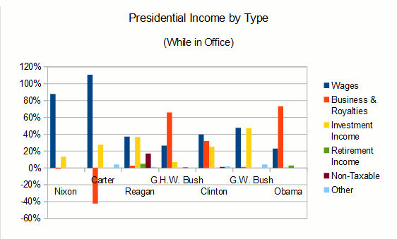
Presidents Nixon and Carter both made their money primarily from their Presidential salaries. Carter's business losses came from his peanut farm; he had the farm placed in a blind trust while he was President, but it was managed poorly, leaving him a million dollars in debt by the time he left office. Other Presidents have had more varied sources of income, with the senior George H.W. Bush and Obama each making the lion's share of their money from book royalties. George W. Bush earned as much interest income from investment trusts as he did from his salary. Reagan made even more from interest, including some from non-taxable bonds.
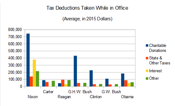
This chart, showing the deductions that the Presidents used, would make Mr. Nixon appear unusually generous to charity. Nope! The majority of this deduction was based on a donation of his Vice Presidential papers to the National Archives in 1969. These papers were appraised with a value of $576,000 (about $3.7 million in today's dollars). Since this deduction far exceeded his income for that year, the excess was carried over year after year. His cash donations were far more meager - as low as $295 in 1972. The method used to appraise the papers seems to have been arbitrary, and the JCT audit later rejected most of the deduction, reducing the value to about $94,000. Not addressed in the audit was whether the papers were even Nixon's to give, since they were generated by the Office of Vice President and were arguably government property.

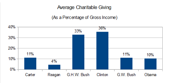
As for the other Presidents, it may be better to compare their charitable giving as a proportion of their income, rather than the dollar amount. Here, the senior Bush and Clinton are the standouts, with most of the others giving the biblical 10%, and Reagan looking like a bit of a cheapskate.
It's important to remember that the taxes that politicians pay are less important than the tax policies that they advocate. Every taxpayer is obligated to pay all of the tax that the law requires, and not a dollar more. Mitt Romney was widely criticized for using loopholes to reduce his tax burden, but what is a "loophole?" It could be defined to include any deduction or credit, up to and including the personal exemptions that nearly all of us use. The question we should ask is not whether Romney, or any political figure (Nixon excluded), paid less tax than they were required to; or perhaps in Jeb Bush's case, more. The questions we ought to ask are whether the tax laws that are in place are benefiting the economy, society, and the country as a whole, and what a candidate would or wouldn't do to change them. The release of personal tax returns by Presidents and candidates, rather than casting judgement on them as a person, should be used to give context to these questions, and their answers to them.

Wednesday, November 5, 2014

The Changing Senate: It's All About Timing and Geography

Much will be said and written over the coming days about the Republican Party's gain of the majority in the U.S. Senate. Certainly there are many reasons that 2014 is a good year for the GOP. For real and perceived reasons, many Americans are dissatisfied with the current state of affairs, and President Obama's approval ratings have been down lately (as many Presidents' ratings are after six years in office). But a degree of the Republicans' success can be traced to the geographical makeup of the open Senate seats, as well as historical events as recent as the 2008 election, and as distant and obscure as slips of paper drawn from a box back in 1789.

Every two years, one-third of the Senate's seats come up for election. To this end, the Senate is divided into three "classes," and in any given election, all of the seats in one of these classes are open. When the first Congress was elected, twenty Senators took their seats from the states that had thus far ratified the Constitution, but none yet knew how long they would serve; each was randomly selected, by drawing lots, to serve either a two, four, or six year term, creating the original classes. Since then, each state that has joined the Union has had their two Senate seats assigned semi-randomly to two of the three classes, in such a way to keep them roughly the same size.

The result is that in any election year, about two-thirds of the states will elect a Senator, and about a third will not (unless there's a special election to fill a vacancy). Each Senate class can be drawn on a map, indicating the states that will elect a Senator. Why does this matter? As we know, any state can be considered a "red," "blue," or "swing" state, and these random selections of geography mean that some classes are redder or bluer than others.

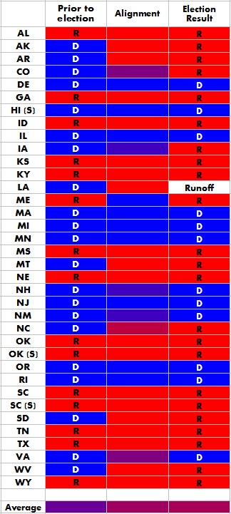
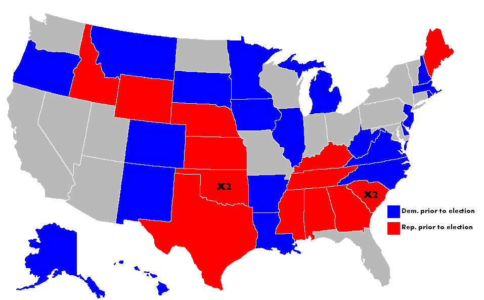
In 2014, Senate Class II was up for grabs. The map of the seats that were open look like this. The gray states had no seats up for election. Oklahoma and South Carolina had two open seats, due to special elections; Hawaii is not a member of Class II, but also had a special election.

But this map only shows what the class looked like before yesterday. The members of Senate Class II were previously elected six years ago, in 2008. Of course, we remember that 2008 was a Democratic wave year. President George W. Bush was deeply unpopular, the economy had just tanked, and Americans had become disillusioned with the wars in Iraq and Afghanistan. In this environment, Barack Obama's campaign struck a chord with many Americans, and many other Democrats were easily elected to office. As a result, Democrats held 20 of the 33 seats in Senate Class II, a significant increase from the 12 out of 33 they held prior to 2008.

We can get a sense of the "normal" partisan leanings of each state, and thus each class, by looking at their votes in the last several Presidential elections. For any given state, we can assume that if it gave its electoral votes to the same party in each of the last four elections (2000-2012), it is solidly red or blue; if it voted for one party three times, it leans toward that party but isn't quite solid; and if it voted for each party twice, it's a "purple" or swing state. By averaging out all of the states that had seats open in 2014, we can see just how purple the class is, compared to its previous and new makeup.

To the right, each of the open seats (inlcuding special elections) are listed with the controlling party before and after the 2014 election. In the middle column is the state's average alignment, based on the last four Presidential votes. The solid red and blue states are obvious, while two states, Colorado and Virginia, are purple. A handful of states (IA, NH and NM) voted three times for the Democratic candidate and once for the Republican, and therefore are blueish, but with a hint of purple. North Carolina, on the other hand, is reddish, having voted for the Democrat one time.

At the bottom of each column, you can see the average color of all of the above cells. All are shades of purple, of course, befitting the grab-bag of red and blue states; but the shade is what matters. Our test of alignment estimates that this list of states (and yes, we're double-counting the states with two open seats) are, on average, aligned 62.5% with the Republican Party. Compare this to the 42% of these Senate seats that the Republicans held previously and the 65.7% that they will hold when the new Congress is seated in January (this figure excludes Louisiana, which we won't know the result of until the runoff next month; but assumes early results in AK and VA will hold). Thus, we can safely say that at least some of the Republicans' gains in Class II is a reversion to the mean.

What does this mean for the future? In 2016, Class III will be up for election. This class was last elected in 2010, which was nearly as much a wave year for Republicans as 2008 was for Democrats. The GOP didn't take the majority in the Senate, but they picked up six seats, to hold 24 of the 34 Class III seats. Using the same alignment test, we can estimate that Class III is 55% aligned with the Republican Party, still slightly on the red side but much more purple than Class II. Given that the GOP currently holds over 70% of the Class III seats, it's not unreasonable to expect them to lose a few in a couple of years, and quite possibly the majority along with them.

Looking further, Class I will come up for election in the futuristic space-year of 2018. This class is the bluest of all, with less than a 42% alignment with the Republican Party; but even so, the GOP may have a chance to reclaim some of their 2016 losses. Class I is currently only 24% Republican, so they may see some pickups in 2018.

Tuesday, November 27, 2012

What's your vote really worth? Updated with post-election data.

In mid-October, I described a formula I developed to compare the value of a U.S. Presidential vote among states. The model takes into account the built-in advantage that smaller states enjoy under the Electoral College system, as well as the competitiveness of each state. The goal was to compare a voter's relative influence on the electoral vote tally. We're not looking for a voter's chance of being the single vote that decides the Presidency; we simply want to know how much they can tip the needle, compared to other states. If you haven't read my previous post, I suggest taking a look to see how I'm coming up with these values.

In the original post, which was three weeks before the election, I calculated the index using projections of the vote to come. Now that the election is over, let's see how those numbers hold up. Please note that the final numbers in many states have not been officially released, and some states are still counting. The numbers I am using are from David Wasserman's 2012 National Popular Vote Tracker as of November 25. The numbers will be updated over time, so this index is still preliminary.

As before, the values in the index use the least valuable vote in the nation as a baseline. Post-election, New York has edged out Oklahoma for the dubious honor of having the least valuable Presidential votes. All other states' scores are expressed as multiples of the New York value.

Rank:State:Value Index:
51NY1.00
50OK1.11
49UT1.26
48MA1.28
47MD1.28
46CA1.38
45TN1.50
44KY1.50
43AL1.65
42IL1.68
41NJ1.88
40AR1.90
39LA1.91
38TX1.98
37HI2.17
36KS2.22
35WA2.29
Rank:State:Value Index:
34CT2.33
33ID2.35
32WV2.50
31DC2.68
30MI2.82
29OR2.87
28IN3.03
27MO3.05
26SC3.60
25NE3.65
24MS3.73
23AZ3.95
22GA4.11
21WI4.66
20PA4.77
19MN4.88
18ME5.41
Rank:State:Value Index:
17RI5.53
16VT5.77
15MT6.18
14CO6.19
13DE6.21
12NM6.73
11IA6.78
10WY6.92
9VA7.25
8SD7.47
7ND9.05
6NV9.58
5OH12.65
4NC12.72
3AK13.87
2NH15.66
1FL30.18

As it turns out, there are some pretty major differences between the projected values and the actual. There are three main reasons for this. The first, and most important, is that when a state's competitiveness is included in the formula, it's going to bring a lot of volatility. Whether a state is considered a safe or swing state, the margins are going to fluctuate from one election to the next, changing the index. And because we used projections in the pre-election index, it was even more volatile. The projection data came from Nate Silver's FiveThirtyEight blog as of October 15. Silver's predictions were overall quite accurate on election day, but as the data was based on ongoing polling, the projections moved around throughout the campaign. Virginia had a particularly high Value Index in mid-October because the polling was razor-thin there at the time; Silver projected the margin at 0.1%. The actual margin in Virginia on election day was 3.9%; still close, but an order of magnitude from the projection three weeks prior. This is not a criticism of Silver's predictions; his numbers were based on polling, which was constantly affected by events in the campaigns and movements in popular opinion. If the vote in Virginia had remained that close on November 6, it would have easily deserved its lofty score; the closer the state's margin is, the more likely that a voter can push the needle and affect the electoral vote.

The second change in the data was the populations used. The formula does not use the state's total population, but rather the voting-eligible population (VEP), which includes residents who are U.S. citizens, at least 18 years of age, and not otherwise barred from voting (due to a felony, for example). For the previous post, I could not find VEP data that was current, so I used the 2010 VEP numbers from the United States Elections Project. Since the election, they have updated their VEP data for 2012, and therefore so have I.

The final change in the data is due to an error I made in the original data set. Remember how I tried to explain away the high score Delaware rated on the index? As it turns out, I had transposed the VEP amounts for Delaware and the District of Columbia. This caused Delaware's score to be inflated, and DC's to be deflated. I apologize for this error.

So, now that we have the post-election scores, what can we learn from this? For one thing, the "swing states" don't have quite the stranglehold on vote value that we saw previously. In October, the top seven states in the index (not counting Delaware) were the most-watched swing states in the election. In the final numbers, however, those seven states (VA, CO, NV, IA, NH, FL, OH) are spread out through the top 14 positions of the index. Most of the other states in between (such as Alaska, #3 on the index) were pretty solid in color. What gives? The swing states fell in the index in large part because they were not nearly as close as predicted in mid-October, with the exception of Florida. The collective margin of the six non-Florida swing states was 3.9% on election day, as opposed to 1.2% in the projection. This lowered their scores enough to be overtaken by a second effect: the small-state advantage. The Electoral College is designed to give states with small populations have more electoral votes per capita than larger states. This makes a vote much more valuable in a small state, even one that tends to vote solidly for one party. Alaska voted for Romney with a 14% margin, but since its population is so low, it would take a smaller number of voters to change that margin (and potentially, the electoral vote) than it would in a larger state with the same margin.

So we see that voters in both swing states and small states have an inherent advantage when it comes to the electoral math. We already know how this affects Presidential campaigning, as the swing states are cluster-bombed with negative attack ads, while the other states' issues and concerns are largely ignored by both sides. But there is a more fundamental problem with this system: it practically disenfranchises some voters, while others are "über-enfranchised," wielding outsized power compared to many of their fellow citizens. As the index shows, a vote in Florida in 2012 was worth more than 30 votes in New York.

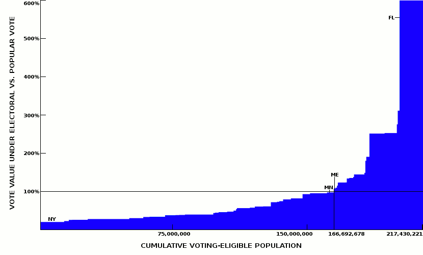
Under a popular vote system, however, every citizen would have an equal vote, and their concerns could not be ignored due to accidents of geography. How does the current system compare to such a nation? Again, I compared the Vote Value Index to a one person-one vote system to see how the value stacks up. Below, the states are listed with the amount of value their citizens' votes hold, compared to their value under a popular vote.

Rank:State:Value vs. Pop Vote:
51NY19.8%
50OK22.0%
49UT25.0%
48MA25.5%
47MD25.5%
46CA27.4%
45TN29.7%
44KY29.7%
43AL32.7%
42IL33.3%
41NJ37.2%
40AR37.7%
39LA37.9%
38TX39.2%
37HI43.1%
36KS44.1%
35WA45.4%
Rank:State:Value vs. Pop Vote:
34CT46.3%
33ID46.6%
32WV49.5%
31DC53.1%
30MI55.9%
29OR57.0%
28IN60.1%
27MO60.5%
26SC71.4%
25NE72.4%
24MS73.9%
23AZ78.4%
22GA81.6%
21WI92.4%
20PA94.6%
19MN96.8%
18ME107.4%
Rank:State:Value vs. Pop Vote:
17RI109.7%
16VT114.4%
15MT122.6%
14CO122.8%
13DE123.2%
12NM133.5%
11IA134.5%
10WY137.2%
9VA143.9%
8SD148.2%
7ND179.6%
6NV190.0%
5OH250.9%
4NC252.2%
3AK275.1%
2NH310.6%
1FL598.8%

A vote in Florida under the current system is worth six times its value under a popular vote, whereas a New York vote only holds one-fifth of the value of a popular vote. Eighteen states, comprising 23% of eligible voters, hold an advantage, with their votes more valuable under the Electoral College. In the other thirty-two states and one district, 77% of us have less power to elect the President than they would under a popular vote.

This may all seem like a moot point, since the Electoral College is a part of our Constitution and cannot be abolished without amending it, which is a long shot at best. However, there is a practical way to institute a popular vote within the framework of the Electoral College, and without Congressional action. The National Popular Vote Plan, advocated by organizations such as FairVote, is a pact between states that can be passed by state legislatures. These states agree to allocate their electoral votes to the winner of the national popular vote. However, this agreement only takes effect when enough states have entered the pact to total at least 270 electoral votes, the number required to win the Presidency. This pact has already been passed into law by nine states, with 132 electoral votes among them (just under half of the requirement), and is under consideration by several other states. When you look at how many states are disadvantaged under the Electoral College, it is easy to imagine enough states joining the pact to change the system. This will only happen, however, with enough pressure from citizens on their state governments.

For anyone wanting to look at the data behind the Vote Value Index, I have a Google spreadsheet with the data.

Tuesday, October 16, 2012

What's the value of your vote? Virginians hit the jackpot.

With the U.S. Presidential election close at hand, I've been thinking a lot about the electoral college. We can all see the effect that the electoral college has on Presidential politics, with a handful of swing states lavished with attention, while most of the states are largely taken for granted by both sides.

It's clear that a voter in the swing states has much more power to influence an election's outcome, but can this difference be measured? I had wondered this idly, but it began to crystallize for me when I read this article by Alan Green, a friend of my wife's, for The State (SC). Alan created a vote value index based on a state's likelihood to have a very close vote, less than 1%. Since that likelihood is very small in most states, the value differentials were very large. I think that his index makes a good measure of the relative odds that one voter in a given state might cast the "magic vote" that tips the national election. However, I wanted to measure a vote's value on a more fundamental and tangible level: one voter's power to move the needle.

I created a formula of my own, which consists of two parts. The first part is an electoral college modifier. This modifier gives a state's electoral votes either a boost or a handicap, depending on how the state's share of the national voting-eligible population compares to its share of the electoral vote. The Electoral College was designed to give smaller states an advantage, and that advantage is reflected in the formula.

The second part of the formula is a margin index. This index measures one individual vote's proportion of the state's probable vote margin, based on current projections. This is designed to account for two facts: a vote is more valuable in a close election, and when two states are equally close, a vote in the state with a smaller population accounts for a larger portion of the margin and is, therefore, more valuable.

I'll get into the math in a moment, but in the meantime, let's find out what your vote is worth. In the final index, I used Oklahoma as a baseline, because I determined that Oklahoma voters have the least valuable votes in the country. Each other state's index is expressed as a multiple of the value of an Oklahoma vote.

Rank:State:Value Index:
51OK1.00
50NY1.03
49AL1.17
48DC1.22
47LA1.31
46UT1.34
45IL1.37
44TN1.49
43MD1.50
42MA1.57
41KY1.59
40CA1.64
39MS1.75
38TX1.77
37KS1.83
36AR1.87
35ID1.95
Rank:State:Value Index:
34SC2.40
33WA2.42
32HI2.57
31GA2.71
30OR2.77
29IN2.82
28NJ2.83
27NE3.10
26CT3.35
25MO3.45
24WV3.51
23MI3.84
22AZ3.96
21PA4.33
20MN4.76
19ME5.71
18RI5.72
Rank:State:Value Index:
17VT5.74
16NC6.36
15WY6.90
14MT7.10
13NM7.67
12SD7.92
11WI8.13
10AK8.31
9ND10.45
8OH10.94
7DE11.72
6FL19.19
5NH26.45
4IA32.51
3NV38.59
2CO107.42
1VA261.50

As you can see, the most valuable votes belong to Virginia's voters. Their votes are a whopping 261.5 times more valuable than an Oklahoman's vote.

Unsurprisingly, the top six states on the index - Virginia, Colorado, Nevada, Iowa, New Hampshire, and Florida - are all considered to be "swing states" this year. Another important swing state, Ohio, is close to its swingin' colleagues, but landed in the #8 spot behind Delaware. How did Delaware, a solidly blue state that FiveThirtyEight gives 99.7% odds of voting Obama, get so high on the list? There are two answers to this question: population and population. First, a Delaware voter punches more than twice his or her weight in the Electoral College, due to its small-state advantage. Second, the small population means that it takes less people to move the percentage margin within the state. Put simply, one person is a larger percentage of his or her state's population if they live in a small state than if they lived in a large state, making their vote more valuable in moving the needle.

Now comes the mathy bit. My teachers always told me to show my work, so I'm going to explain how my formula works, using my home state of North Carolina as an example. I've also posted a Google spreadsheet for those who want to really delve into the data.

As I stated, the formula has two parts. The total Vote Value Index at its simplest is as follows:

Where ECM is the Electoral College modifier, MI is the margin index, and n is a constant (to set the baseline state to 1 and all others relative to that).

The ECM is designed to show how a state punches above or below its weight in the electoral college:

Where VEP is the voting eligible population. This includes a state's residents who are U.S. citizens, at least 18 and not otherwise ineligible. I used the 2010 VEP numbers provided by the United States Elections Project.

The ECM compares the state's share of the national population to its share of the electoral vote. The national average is about 395,245 eligible voters per electoral vote (the national VEP divided by the total electoral votes, 538). States with more voters per electoral vote, generally large states, will have an ECM that is smaller than their electoral vote count. The opposite is true of smaller states, with more voters per electoral vote.

Using North Carolina as an example, we find an ECM of 13.1, a bit less than our 15 electoral votes.

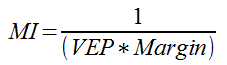
Next, we determine the Margin Index, by multiplying the state VEP times the projected margin, and inverting it:

For the projected margin of each state, I used data from FiveThirtyEight as of October 15, 2012. If you've made it this far into this post, then I strongly suggest that you make FiveThirtyEight a part of your balanced blog breakfast.

Again, applying this index to North Carolina:

Right now, you might be saying, "Wow, that's a small number." To which I reply, well, yeah. We just divided one voter by the number of voters it would take to flip the state. This number represents one person's influence on that process. What's important here is how the states compare to each other; a larger state with a higher projected margin will have a much smaller margin index. Don't worry about the scientific notation; when we apply our constant, the numbers will be moved into a range we can wrap our brains around.

Which, incidentally, is where we are. It's time to combine the two parts of the formula to determine the Vote Value Index in North Carolina:

We determine that my vote is worth 6.36 times that of an Oklahoman's vote. But don't feel too good for me, because my neighbors to the north have a vote value over 41 times that of mine.

The absurdity of this situation leads us to a final question: if we were to scrap the electoral college and go to a straight popular vote, who would be the winners and losers? How does my vote compare in value between one system and another? Under a popular vote, everyone would have equal influence, and candidates would have to seek every vote they can get, in every state. No one could say that their vote was worth less than another's, no matter what state they live in. But how do we measure the difference?

I divided each state's VVI by the average of all states' VVIs to determine how valuable your vote is now, compared to a popular vote system.

Rank:State:Value vs. Pop Vote:
51OK7.7%
50NY7.9%
49AL9.0%
48DC9.4%
47LA10.1%
46UT10.3%
45IL10.6%
44TN11.5%
43MD11.6%
42MA12.1%
41KY12.2%
40CA12.6%
39MS13.5%
38TX13.7%
37KS14.1%
36AR14.4%
35ID15.0%
Rank:State:Value vs. Pop Vote:
34SC18.4%
33WA18.6%
32HI19.7%
31GA20.9%
30OR21.3%
29IN21.7%
28NJ21.8%
27NE23.8%
26CT25.8%
25MO26.6%
24WV27.0%
23MI29.6%
22AZ30.5$
21PA33.4%
20MN36.6%
19ME44.0%
18RI44.0%
Rank:State:Value vs. Pop
Vote:
17VT44.2%
16NC49.0%
15WY53.1%
14MT54.7%
13NM59.1%
12SD60.9%
11WI62.6%
10AK64.0%
9ND80.4%
8OH84.2%
7DE90.2%
6FL147.7%
5NH203.6%
4IA250.3%
3NV297.0%
2CO826.9%
1VA2,013.0%

So, my vote in NC is worth roughly half what it would be under a true "one person, one vote" system. An Oklahoman vote is worth only 7.7% of a popular vote, whereas a Virginia vote is worth more than 20 times as much as a popular vote.

As it turns out, the voters of only six states have an advantage this year under the electoral college. These six states represent about 16.8% of the national voting-eligible population. The other 83.2% are shortchanged.

Again, my full data set is available for perusal.